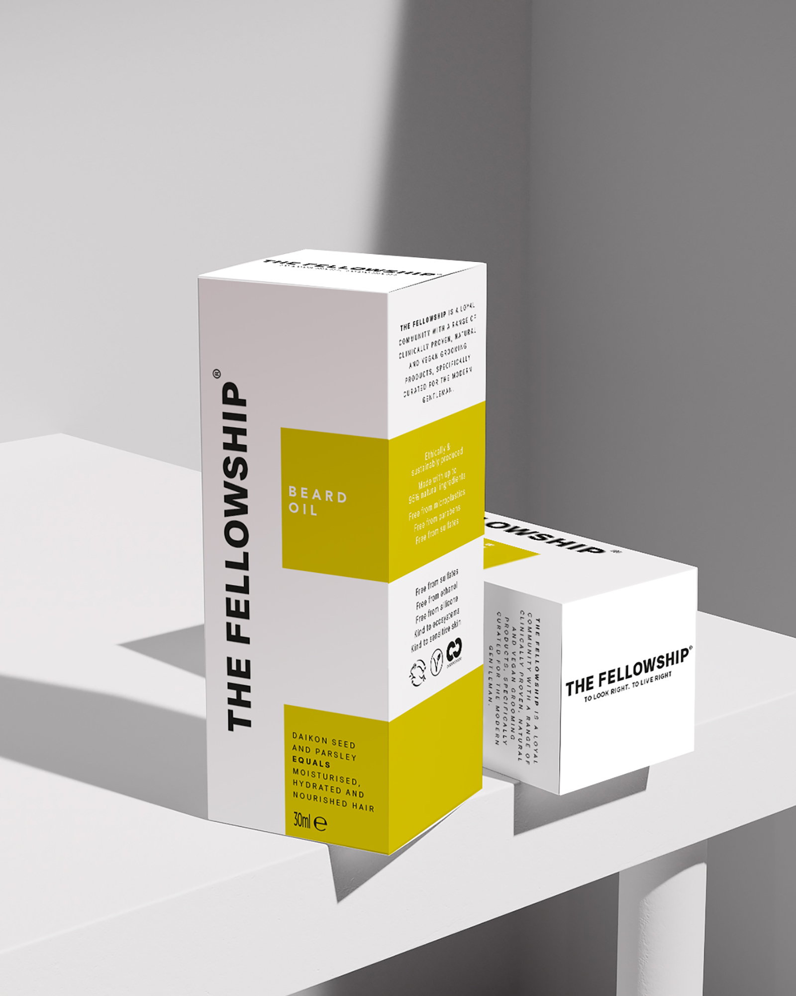
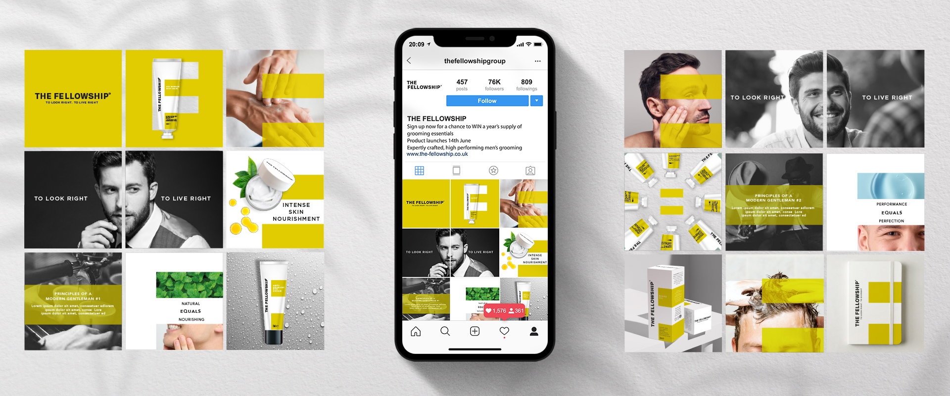
Free The Birds has revealed its latest work for a brand-new, inclusive men’s grooming brand, ‘The Fellowship,’ from model and entrepreneur Andrew Cooper, and award-winning marketeer, Duncan Morris. The disruptive brand identity brings packaging design, typography, and tone of voice together to communicate The Fellowships’ core values of community and equality – what the brand describes as the ‘ethos of the modern gentleman.’
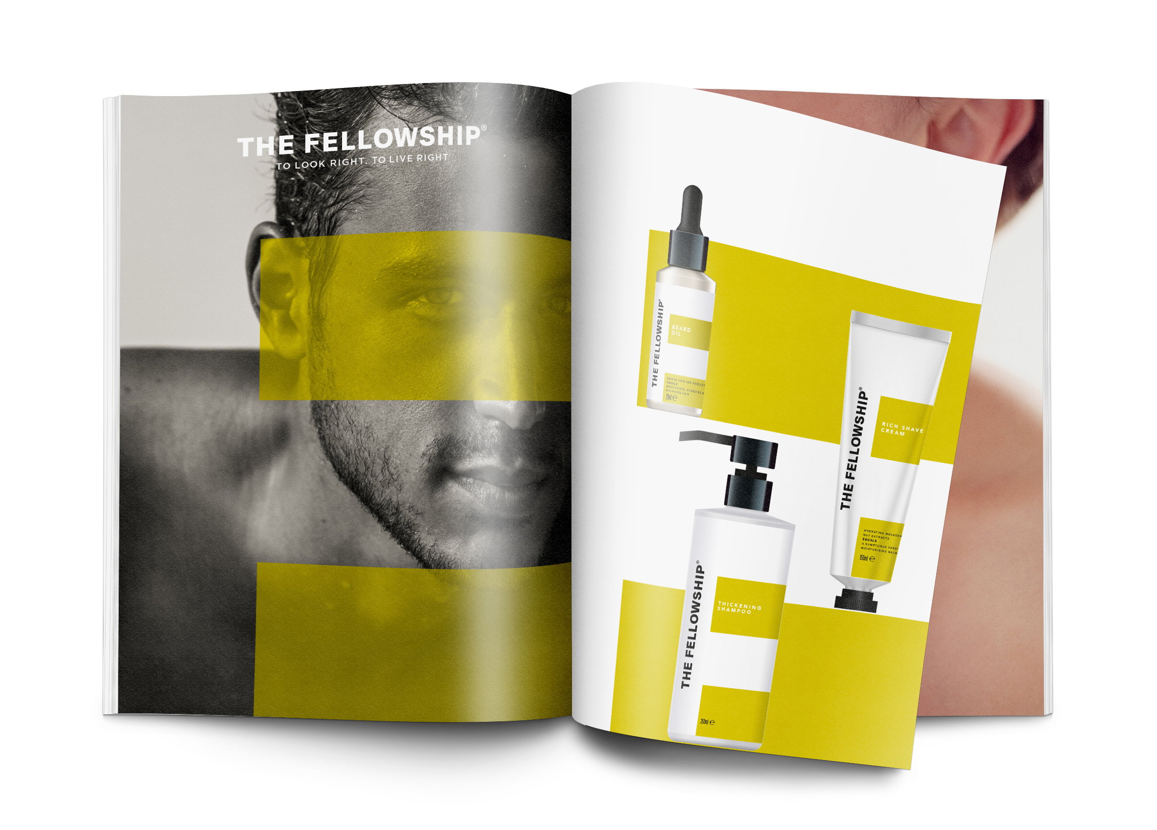
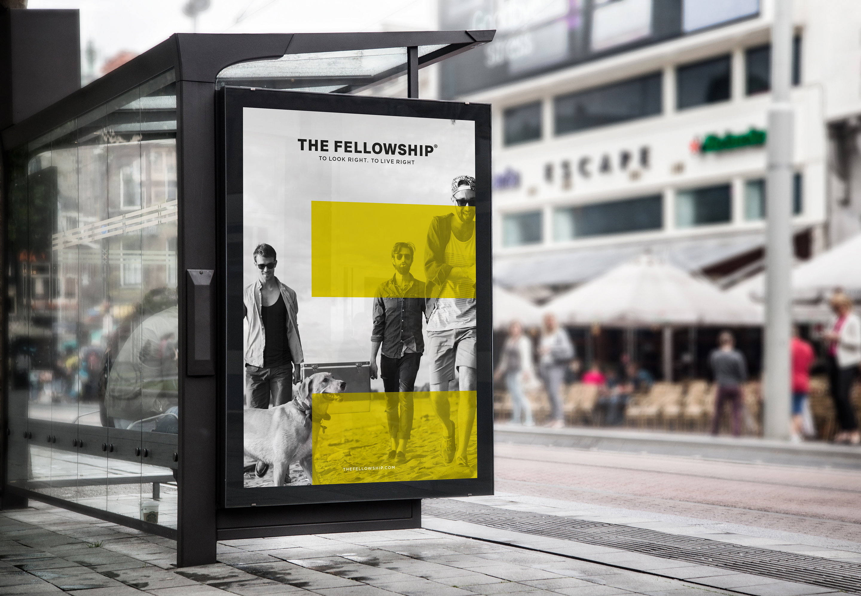
In order to reflect The Fellowship’s ambitions to disrupt more traditional notions around masculinity, and also ensure the new brand stands out from its peers on the shelf, Free The Birds deliberately opted for an eye-catching chartreuse color palette – a significant departure from the rich, heavy tones that are typical of the category. “The tradition with men’s grooming products is to opt for greys, blacks, and browns. But notions of masculinity are changing, and with that, our gendered preconceptions of color,” explained Nick Vaus, Creative Director and Partner at Free The Birds.
“The bright, accented color palette we’ve chosen conveys just the sense of modernism that The Fellowship and its target customers embody, and also ensures the products catch the eye of the customer straight away, which is particularly important for new brands entering this competitive category.”
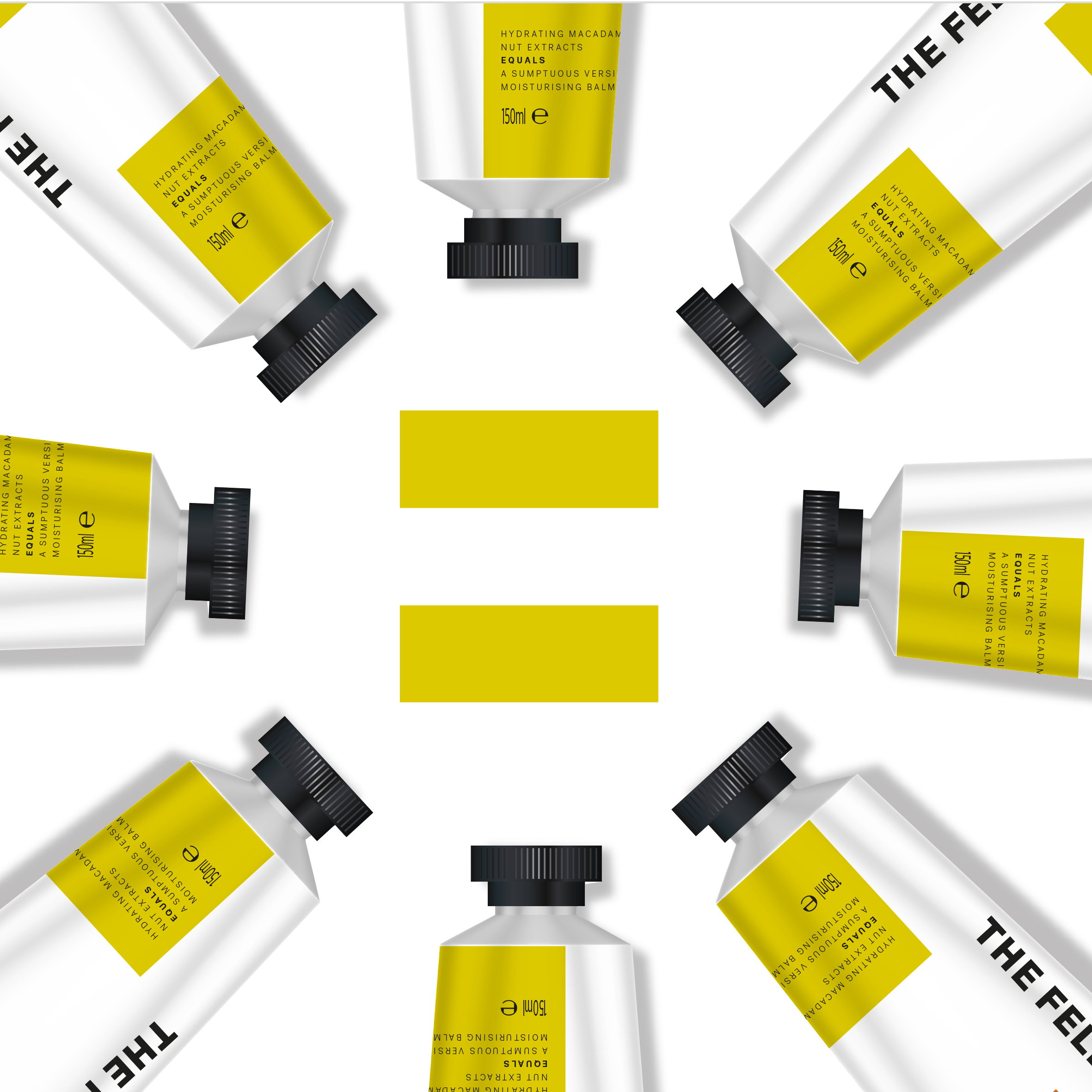
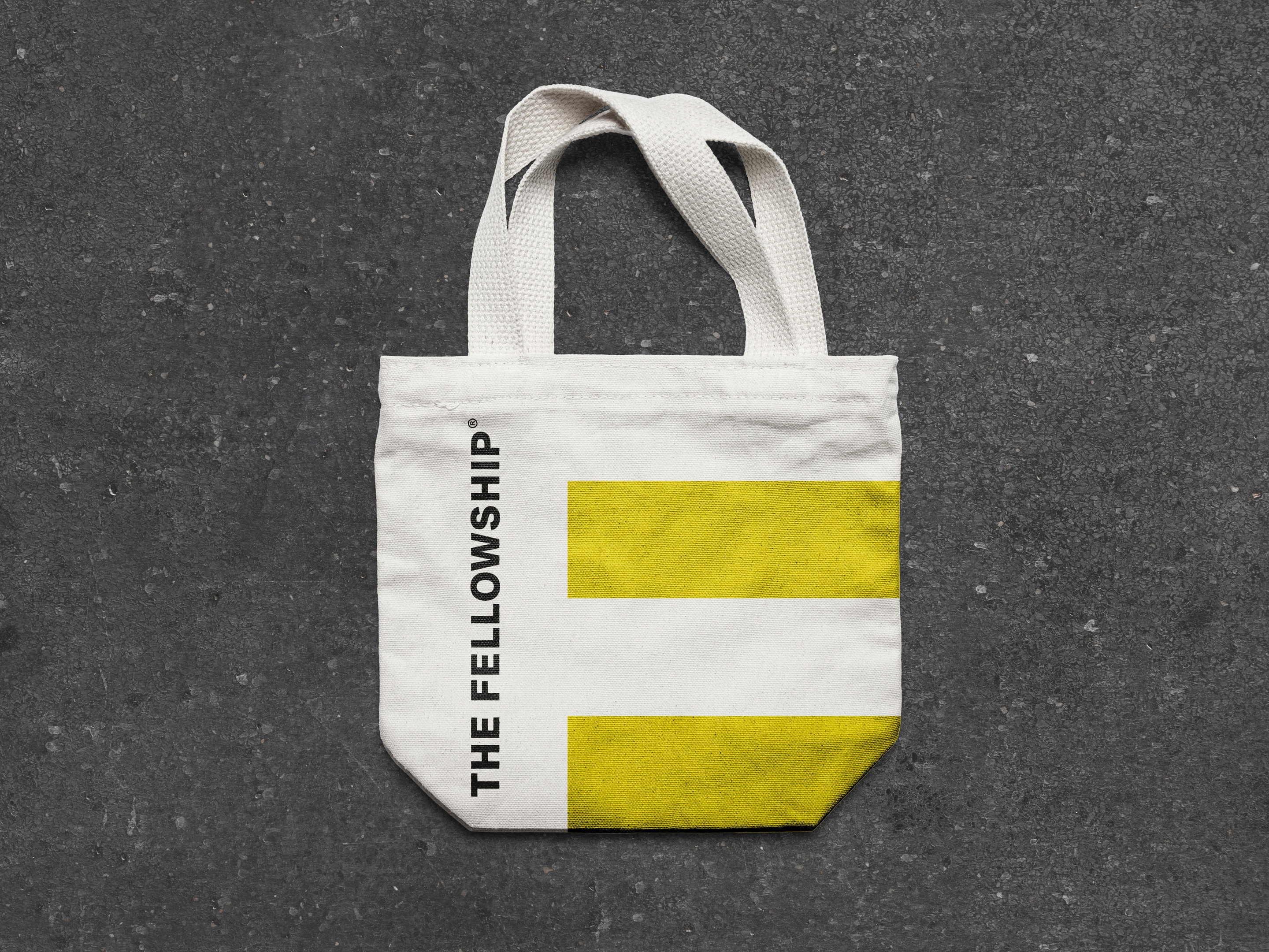
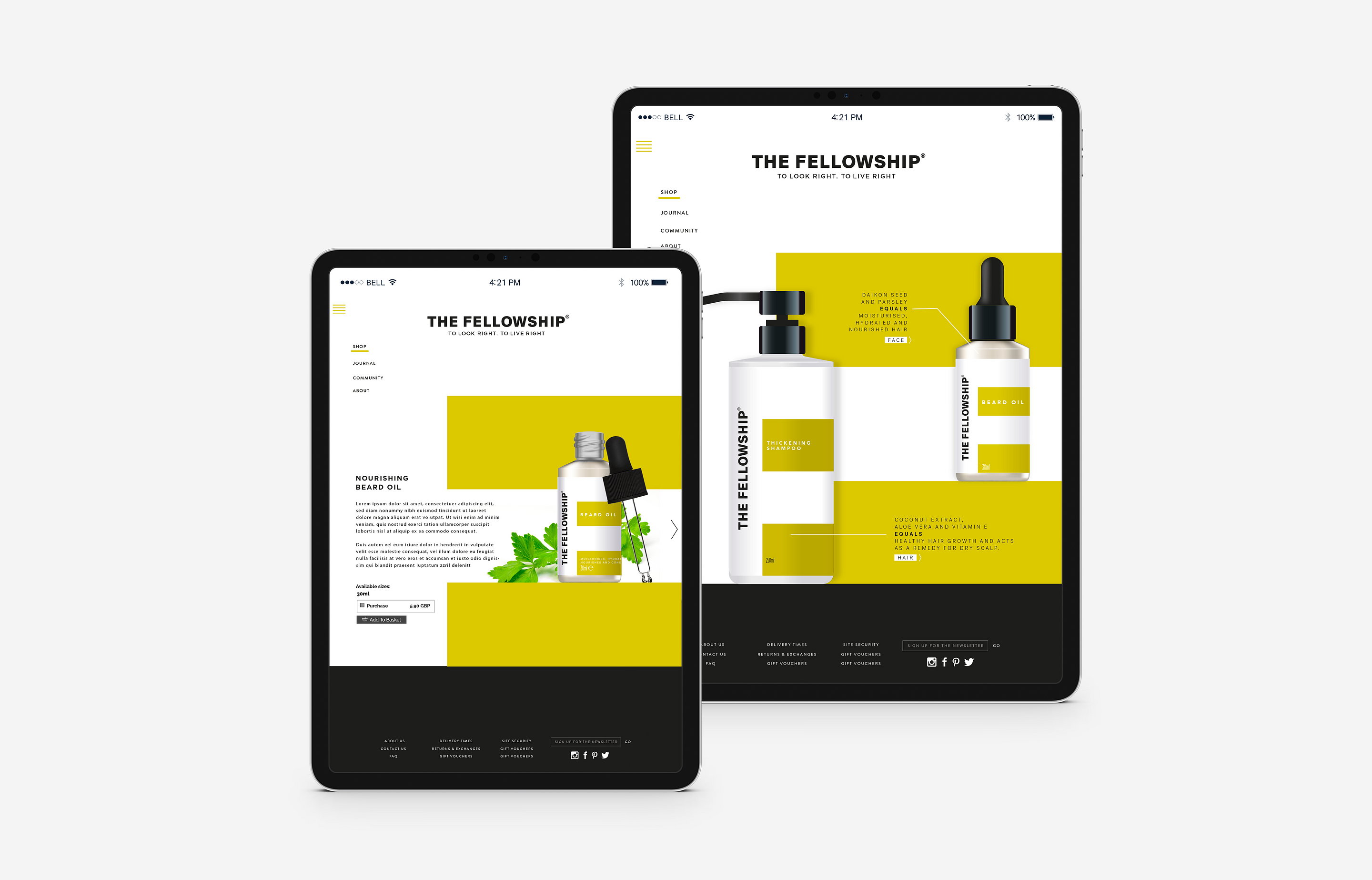
On each product, the bold information labels are arranged over a plain white background in the shape of an equals (=) sign – a striking motif that artistically encapsulates and communicates The Fellowship’s core values. Simple jet-black lids, pumps, and text, meanwhile, create an industrial feel and inject a level of maturity and quality to the design.

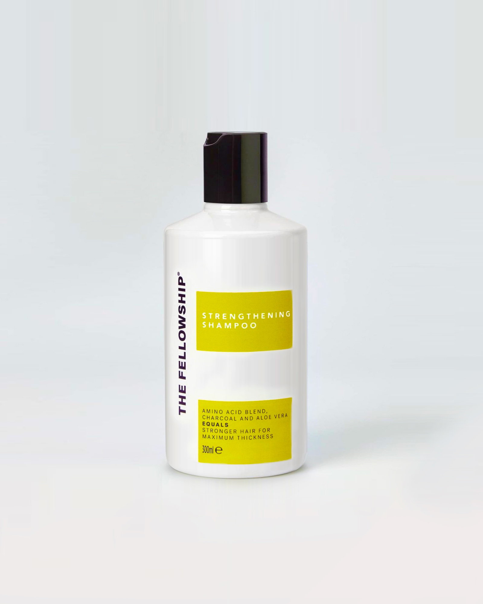
For the information labels, simple sans-serif typography facilitates clear and direct messaging around each product’s benefits, while the ‘equals’ motif appears again in each description to help communicate a sense of ‘no-frills’ simplicity about self-grooming, that the brand also wanted to champion.
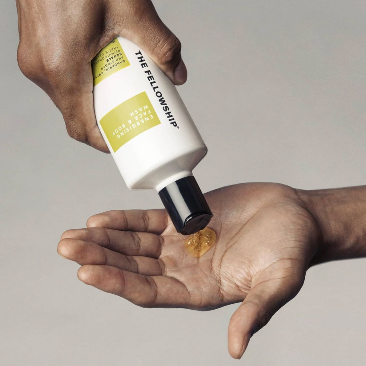
The Fellowship’s name and logo, meanwhile, is proudly printed in bold black typeface along the side of each pack in the negative white space – a deliberate decision that speaks to the attitude of pride and shamelessness around self-care and self-identity that The Fellowship hopes to foster within its customer community.
The bold brand identity will first appear on The Fellowship’s ‘Essential Founders’ Kit,’ which launched this week, including a body wash, body cream, moisturizer, shampoo, and conditioner, before being rolled out to more products later in the year.

Photos: Courtesy of Free The Birds
