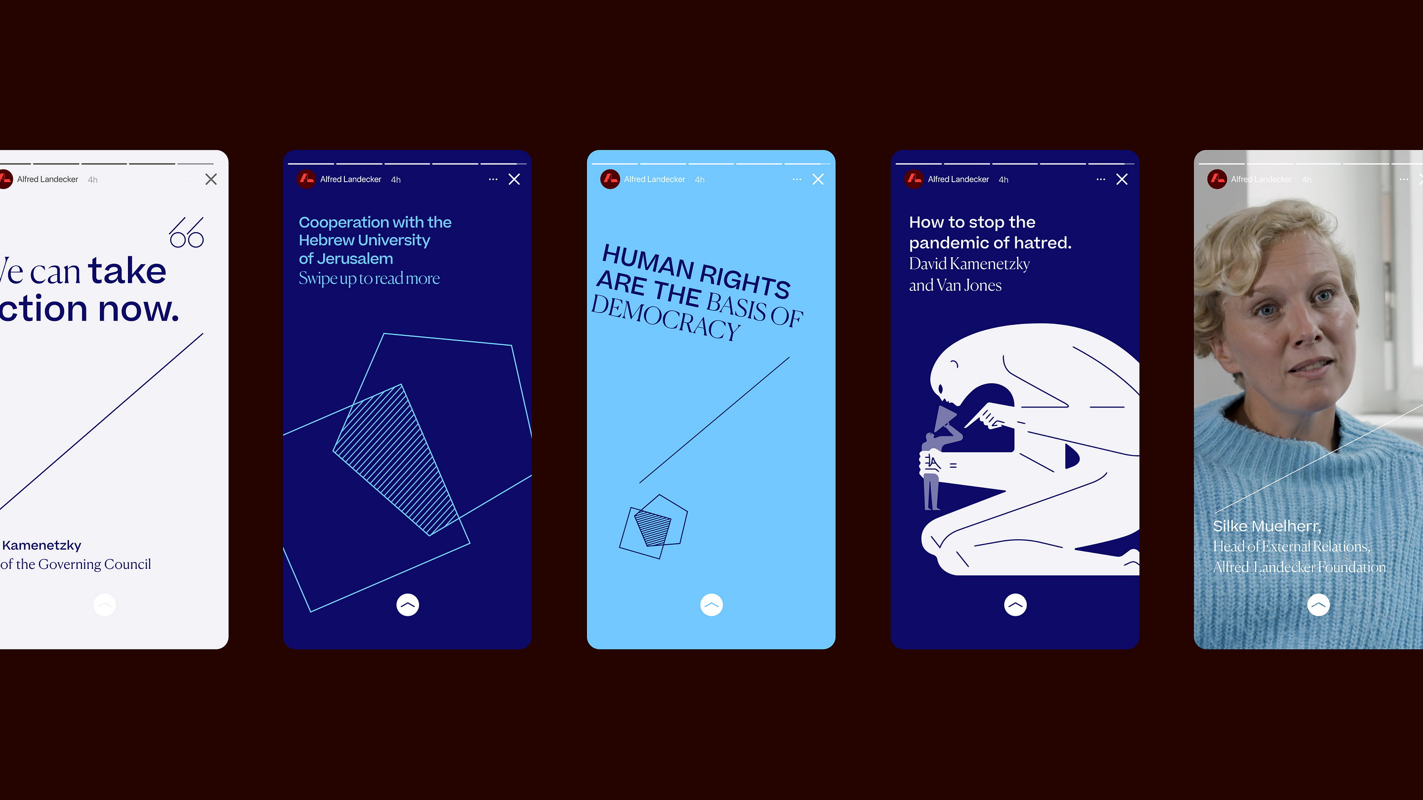
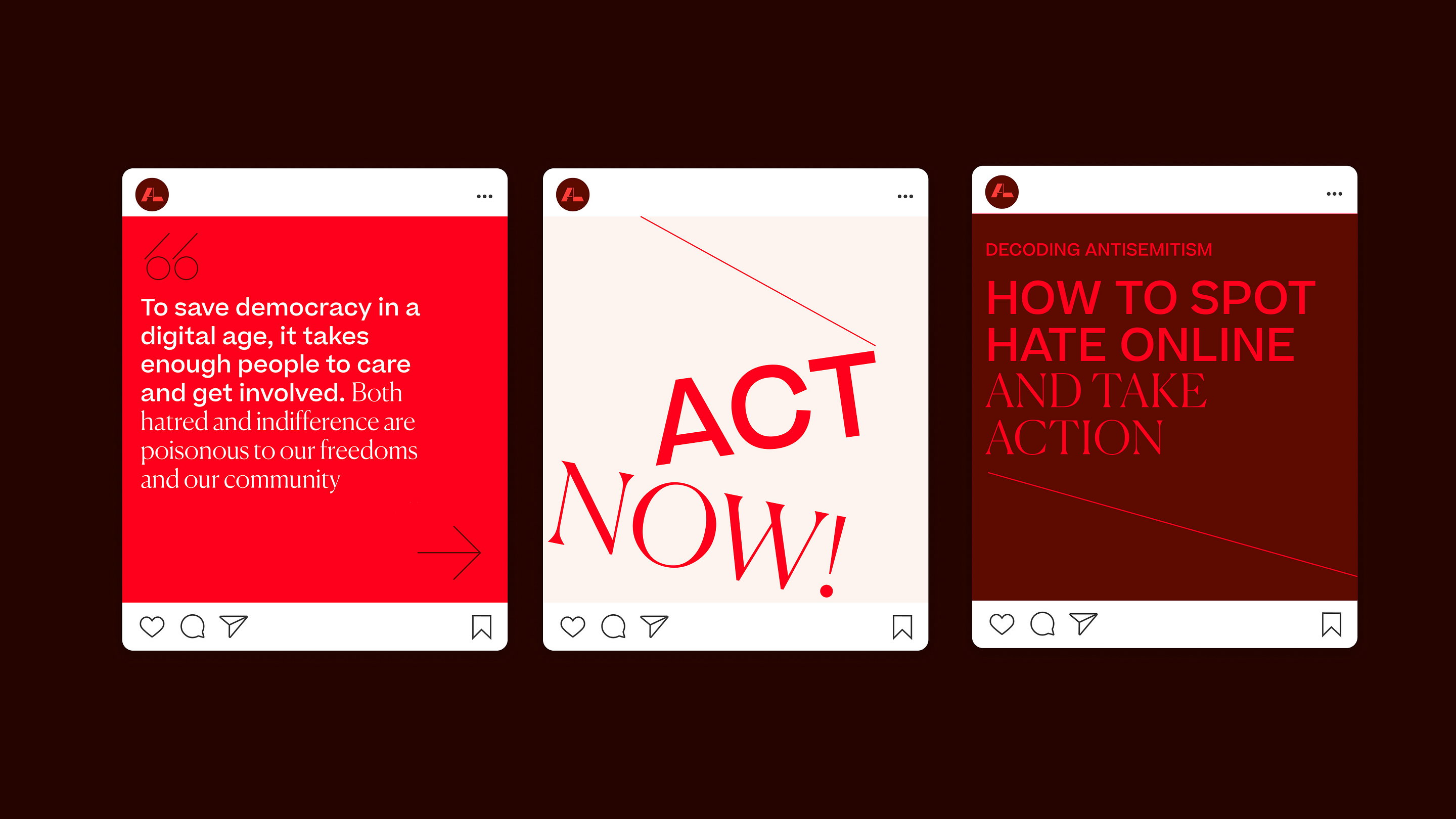
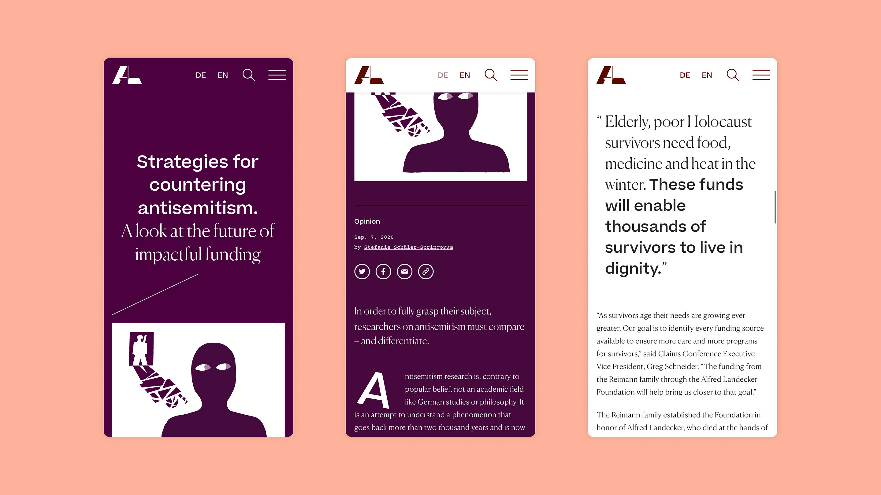
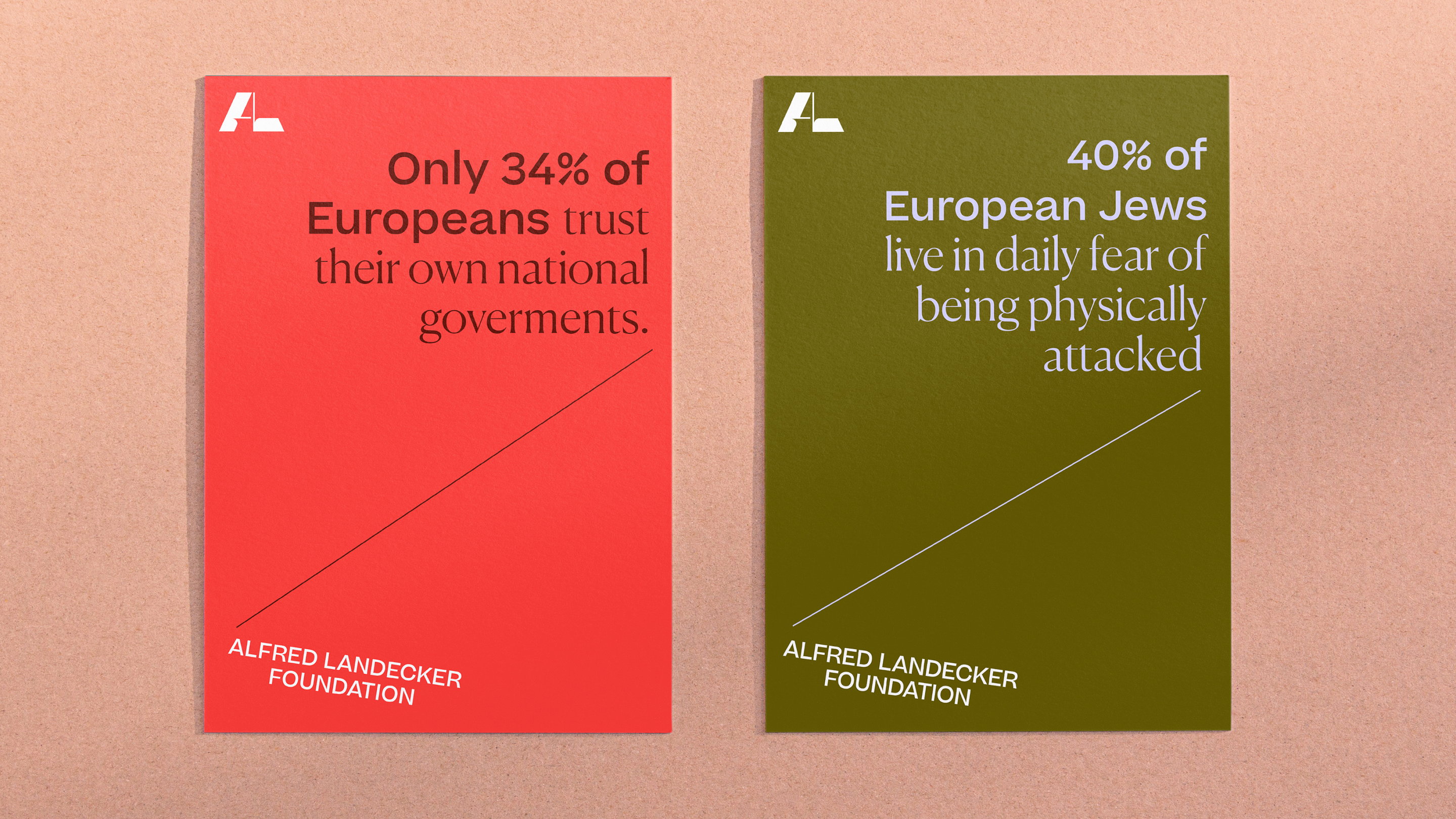
Output has created a challenging and provocative brand identity while retaining enough authority to be taken seriously. At its heart is the idea of frail structures that are under threat. This is reflected in the monogram logo itself, with its contrast of fine hairlines resisting the dominant, heavy strokes applying pressure.
In the face of rising nationalism and hatred directed at minorities, The Alfred Landecker Foundation exists to defend liberal societies and protect democratic structures. Output worked with the foundation to support this significant mission, through a brave new digital editorial platform and visual identity.
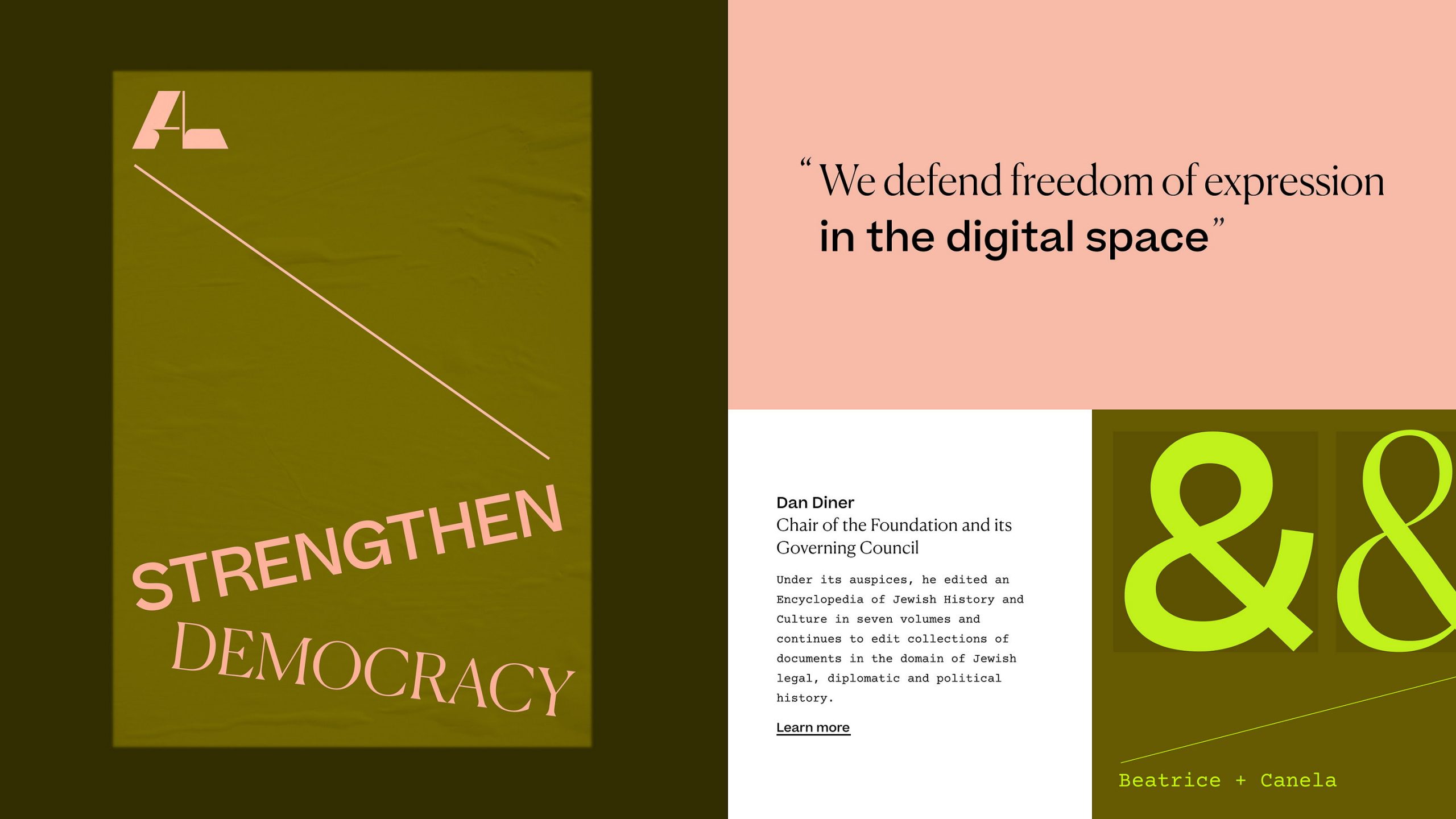
Elsewhere, typography is set at unusual angles to add to the sense of discontent, with hover states shifting the content off-balance. Provocative questions are introduced to challenge the reader’s preconceptions about the subject matter. And deliberately uncomfortable color combinations are used to draw attention to more confrontational topics, while more harmonious ones are applied to thought-provoking content.
The biggest challenge was to inspire active participation over current apathy, particularly among younger people. The designers’ approach was deliberately unconventional. The site is designed and built around the tension between two principles: The frailty of democracy against the chaos in the world, and a call-to-arms to build a civil response and do better.

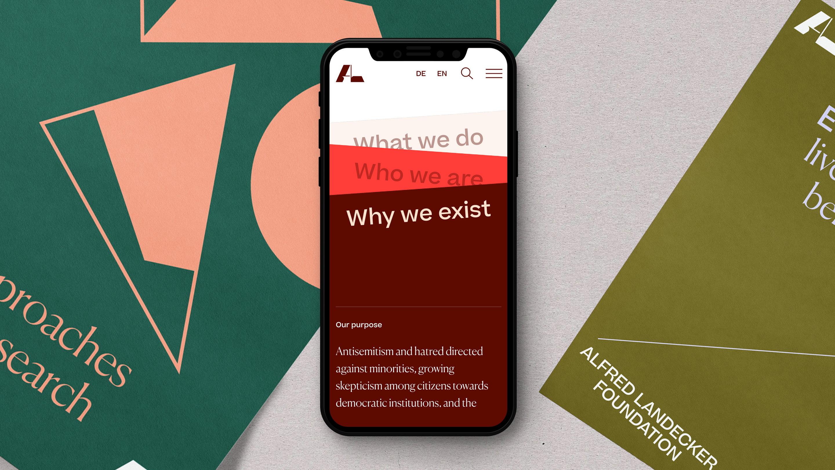
Rather than follow passive naming conventions – ‘About us,’ ‘Projects,’ etc. – the core navigation is built to answer three simple questions: ‘What we do,’ ‘Why we exist’ and ‘Who we are.’ These pages restack as you view them, to reflect how they affect each other and create a more immersive experience.
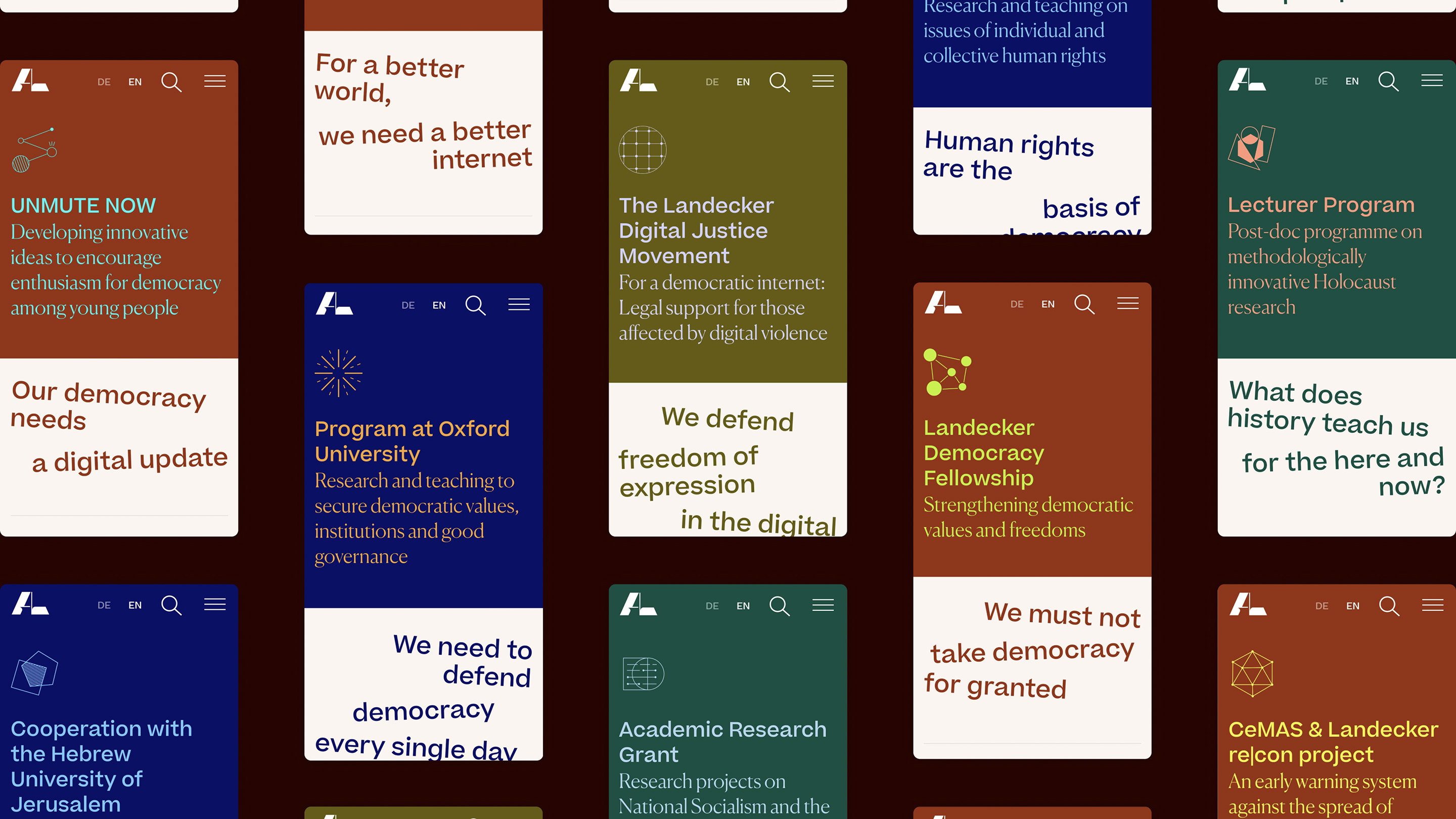
To invite the reader in, navigation is focused around what the Foundation does, such as ‘Strengthen democracy’, or ‘Depolarize debates’ (sic). These manifesto-style topics demand action, linking everything ALF does to the audience’s needs. Instead of traditionally nested pages, the topic types are color-coded so you can follow them around the site and build a sense of how they’re connected.
