Colours and fonts are crucial in determining how a company is viewed in the dynamic realm of branding, where first impressions are more important than ever. These visual elements are not just decorative—they are strategic tools that communicate personality, evoke emotions, and build recognition. Whether launching a startup or refreshing an established brand, understanding the psychology and impact of colours and fonts can be the key to unlocking deeper connections with the audience.
Why Colours Matter in Branding?
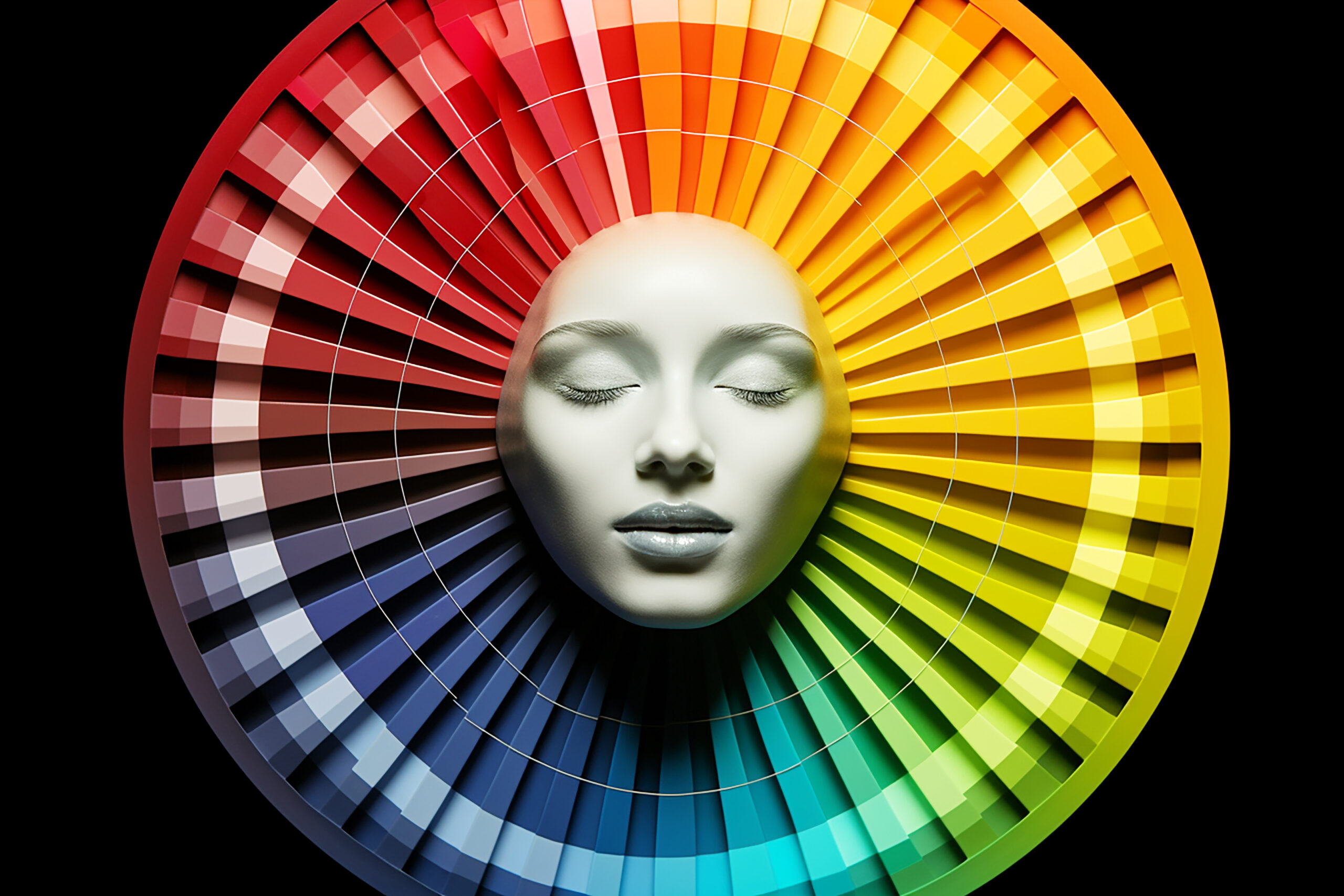
Colour is one of the first things people notice about a brand. It’s a powerful non-verbal communicator that can influence mood, behaviour, and perception. According to research, colour increases brand recognition by up to 80%. But how does it work?
The Psychology of Colour
Each colour carries psychological associations that can trigger specific emotions:
- Red: Enthusiasm, vigour, and urgency (used by Netflix and Coca-Cola, for example)
- Blue: Trust, calmness, professionalism (seen in Facebook, IBM, and PayPal)
- Green: Sustainability, growth, and wellness (used by Spotify and Whole Foods)
- Yellow: Brightness, friendliness, and inventiveness (think of McDonald’s and Snapchat).
- Black: Sophistication, luxury, elegance (used by Chanel and Nike)
Choosing the right colour palette is about aligning these emotional cues with the brand’s values and target audience. For example, a wellness brand might lean into calming greens and soft neutrals, while a tech startup may opt for sleek blues and greys to convey reliability and innovation.
Colour Consistency Builds Recognition
Consistency in colour usage across all brand touchpoints—logo, website, packaging, social media—helps build a cohesive identity. Think of Tiffany Blue or Starbucks Green—these colours are instantly recognisable and deeply tied to the brand’s story.
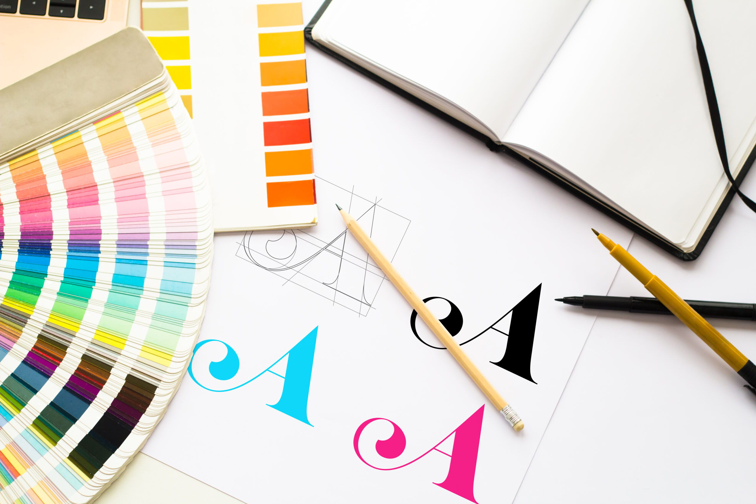
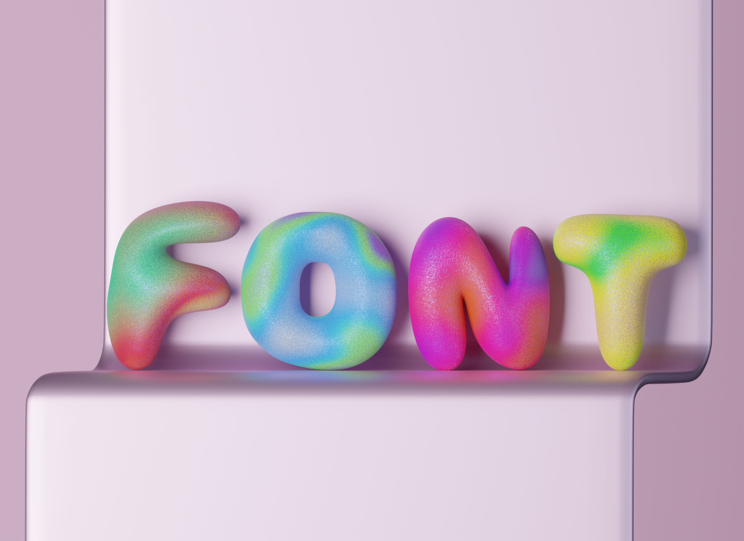
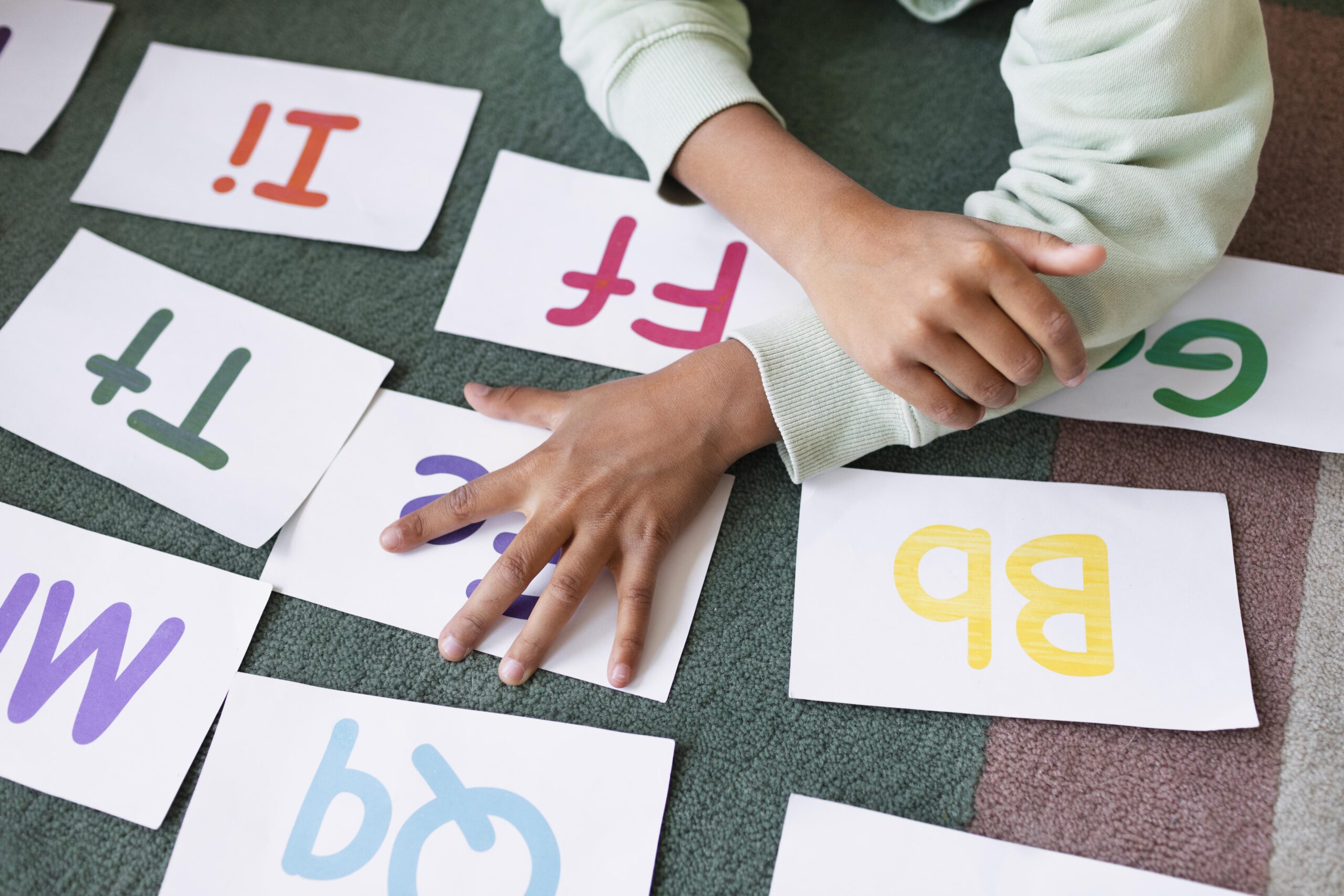
Fonts: The Voice of Your Brand
While colours speak to emotions, fonts give your brand a voice. Typography sets the tone for how your message is received and can subtly influence how trustworthy, modern, or playful your brand appears.
Serif vs. Sans-Serif: Choosing the Right Style
- Serif fonts, such as Georgia and Times New Roman: Classic, sophisticated, and reliable.
- Sans-Serif Fonts (e.g., Helvetica, Arial): Clean, modern, and approachable. Popular among tech companies and startups.
- Script Fonts: Artistic and personal, but should be used sparingly for emphasis or in logos.
- Display Fonts: Bold and attention-grabbing, ideal for headlines or branding elements.
Typography Hierarchy and Readability
Good branding doesn’t just rely on font choice—it also depends on how fonts are used. Establishing a clear typographic hierarchy (headlines, subheadings, body text) ensures readability and guides the viewer’s attention. Strategic font pairing, such as using a bold sans-serif for headers and a crisp serif for body text, can improve user experience and provide visual harmony.
The Synergy of Colours and Fonts
When colours and fonts are thoughtfully combined, they create a visual language that tells the brand’s story. For example:
- To convey sophistication and serenity, a high-end skincare company may combine sophisticated serif fonts with subdued earth tones.
- A children’s toy company could opt for bright, primary colours with playful display fonts to convey fun and energy.
- A fintech startup may choose cool blues with modern sans-serif fonts to build trust and convey innovation.
This synergy is what makes branding memorable. It’s not just about looking good—it’s about feeling right.
Tips for Choosing Colours and Fonts for Your Brand

- Know Your Audience: Understand who you’re speaking to and what appeals to them.
- Define Your Brand Personality: Are you bold and edgy or calm and nurturing? Let this guide your design choices.
- Test for Accessibility: Ensure your colours and fonts are legible and inclusive for all users.
- Stay Consistent: Use a brand style guide to maintain consistency across platforms.
- Seek Professional Help: A brand designer can help translate vision into a cohesive visual identity.
Design with Purpose

In branding, every detail matters. Fonts and colours are strategic choices that influence how people remember and interpret your brand, not just purely aesthetic ones. By understanding their psychological impact and using them intentionally, you can craft a brand identity that resonates, stands out, and endures.
Whether you’re building a brand from scratch or refining an existing one, remember: design is not just what it looks like—it’s how it works.